Summary
Power BI gets simplified Gantt charts that improve readability.
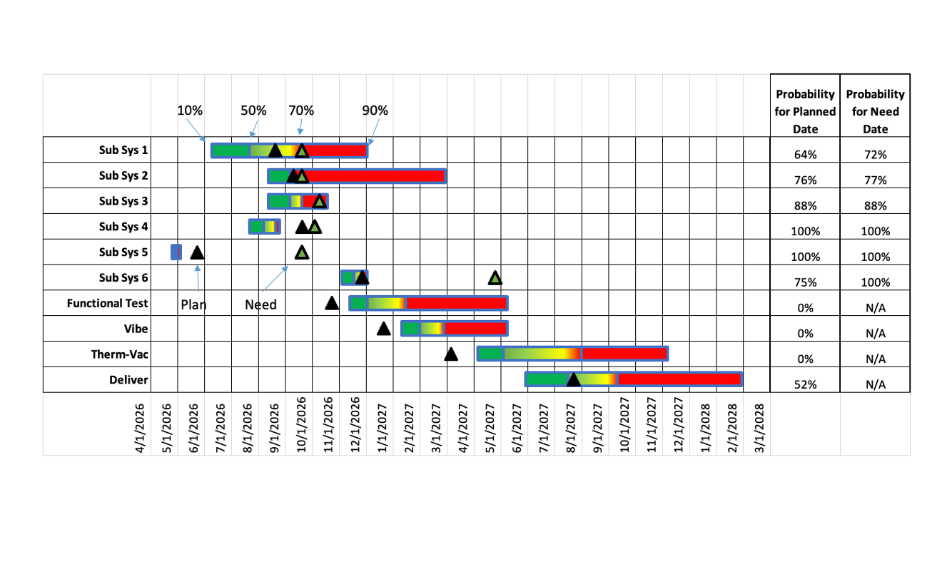
Power BI: simplification of Gantt charts
A recent blog post discusses how Power BI can assist users in simplifying complex Gantt charts. By creating a simplified timeline view, users can quickly gain insights into where the most attention is needed. This contributes to effective data visualization and makes project management more manageable.
Why this is important
The ability to simplify Gantt charts is crucial for BI professionals, as it facilitates the communication of project statuses. In a time where organizations must respond quickly to changes, Power BI offers a strong alternative to other visualization tools that may introduce more complexity. This aligns with the broader trend of simplifying data analysis to generate actionable insights.
Concrete takeaway
BI professionals should emphasize the importance of clear visual communication in projects and implement this new technique in Power BI to enhance the effectiveness of reports.
Deepen your knowledge
Knowledge Base
Dashboard Design — 7 rules for effective data visualization
Learn the 7 golden rules for effective dashboard design. From choosing the right chart type to visual hierarchy and user...
Knowledge BaseWhich chart type to choose? The complete decision tree
Bar chart, line chart, pie chart, or scatter plot? Discover which chart type to use when with our practical decision tre...
Knowledge BaseStorytelling with data — From numbers to compelling narrative
Learn how to turn data into a compelling story. Discover the three ingredients of data storytelling, the SCQA framework,...
Related articles

different takeaway, different graph
One chart for all rarely works: how the same data tells clearer stories with different charts.

what is a choropleth map?
Guide to choropleth maps: what they are, how to read them, when to use them and common mistakes.

move beyond busy bullets
Improve busy lists by restructuring content instead of editing it for better readability.

be careful using questions as slide titles
Why questions like slide titles can be problematic: Clear conclusion titles help your audience focus better.